

Combining Data with Persuasion
Combining Data with Persuasion
Being able to use numbers to tell an accurate, insightful and thoughtful story is a critical skill for all leaders…

“Information is the oil of the 21st century, and analytics is the combustion engine.”
– Peter Sondergaard, Senior Vice President, Gartner Research
Being able to use numbers to tell an accurate, insightful and thoughtful story is a critical skill for all leaders, particularly a senior finance executive. The ideal is to go beyond explaining what has happened. Finance leaders ought to put numbers in context that makes comparison easy and forecast what might happen in the future.
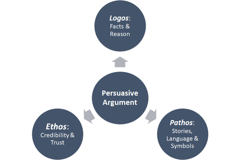
In our high school and college writing classes, many of us learned about the importance of combining the Aristotelian triumvirate of logos, pathos and ethos to make a compelling and persuasive argument. Linda Peek Schacht, a former government press secretary, writes a piece for Brookings contrasting the persuasive argument styles of Governor Andrew Cuomo and President Trump in their daily briefings. Governor Cuomo offers a good example to leaders of how a combination of facts and emotional content delivered consistently over time can build trust and credibility.
Most Americans have increased their consumption of entertainment and news media in the last month as the COVID-19 pandemic intensified in severity. Coverage of COVID-19, both the virus and its impact on daily life, across broadcast and written journalism has been replete with pieces of data, analysis of numbers and trends, as well as discussions about likely and possible future outcomes.
I find the media interest in numbers and analysis fascinating. I am guessing that I am not alone in my fascination. To anyone whose work revolves around numbers, it feels like numeracy is witnessing a rebirth.
This piece will take some of the publicly available data on the COVID-19 pandemic and relate it to the use of data and analysis in the business world. Business leaders who make good decisions and get their team excited to follow their leadership are able to combine logos and pathos to build and sustain ethos.
Put Data in Context: Large numbers or large percentage changes make for great headlines in news stories and business presentations. However, data without context is not particularly useful. We hear regularly how many individuals have tested positive for the COVID virus. Without knowing the amount of people being tested it is hard to put the number of positive tests in context and understand the implications.
Points vs. Trends: We all like to choose a data point that makes our argument as compelling as possible. My advice to my finance teams is to never let a single data point (whether a daily, weekly, monthly or quarterly data point) be the cause for too much joy or consternation. Trends matter a lot more. Looking at data over time gives a much better picture of what is happening. Often it is best to show data as a trailing or moving average over a period of data points. Governor Andrew Cuomo’s daily briefings on the evolution of COVID in NY State uses trend lines well.
Common Size Ratios: Common size ratios are critical when comparing two different “populations” (it could be countries or US states in the case of COVID) or companies (when benchmarking business performance).
Westchester country (where I live) had recorded 461 COVID deaths through April 10th . By comparison Staten Island (Richmond county) had recorded 292 deaths. On deaths alone, Westchester county appears to be in worse shape. However, as a % of the confirmed positive tests, the Westchester county death rate is 2.5% and the Staten Island death rate is 4.3% or 73% higher.

Segment The Data: We have heard and read reports that age and gender both influence the likelihood of death from a COVID infection. NY State data (through April 10th) reveals that 83% of those who died were 60 years old or older. And men accounted for 60% of all deaths. Both these percentages are higher than the representation of these groups in the total state population.
Similarly, remember that averages in business data (churn rates, acquisition cost etc.) can hide important segment level data. Make sure to understand acquisition costs (and other key metrics) at the segment level and by channel.
Controlling for Seasonal Variations: We all know our businesses perform differently over the course of the year. In B2B businesses, the third month of each calendar quarter is typically the month with the highest level of bookings. In B2C businesses, purchases increase dramatically in Q4 around the holiday season. Thus, it is more reasonable to compare Q1 2020 bookings and revenue with the 2019 Q1 levels and not the 2019 Q4 levels.
The visual below shows the importance of showing data relative to the same period a year earlier. Air travel is now down over 95% on a year over year basis.

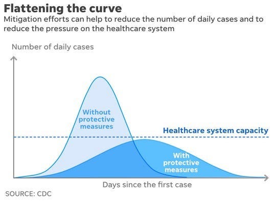
Calculus and the Rate of Change: Most of us assumed we’d never hear about calculus after finishing our high school math curriculum. The oft-used term “flattening the curve” refers to the reducing the “rate of change”. Analyzing rates of change is a key component of calculus. COVID is re-teaching us how much the shape of a curve matters.
In business, we know the importance of growth rates (the first derivative) to valuation. And if growth rates are accelerating (the second derivative), as happens when a product or service moves from “early adopters” into the mainstream, investors get really excited and bid up the valuation of that company.
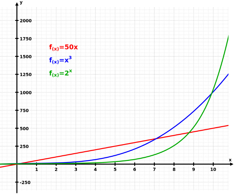
Exponential Growth: Grant Sanderson, who has created a math YouTube channel called 3Blue1Brown has an excellent video explaining how exponential growth works and how it applies to the spread of COVID. Phenomena that follow an exponential curve show surprisingly slow growth for a period of time as the graphic below shows (red = linear, blue = cubic, and green = exponential) before increasing dramatically.
It should not be surprising that business models which have strong network effects use the term “virality” to describe their growth. Venture investors love business models with strong network effects due to the potential for exponential growth.
Leading and Lagging Indicators: Politicians, medical experts and newscasters are talking about leading and lagging indicators. I never expected to see these terms in mainstream dialogue.
The most common metrics used to evaluate a business are lagging indicators. They are related to “goals” or “outputs”, tend to be easy to measure and tell us about what has already happened. Revenue is a prime example of a lagging business indicator. In the world economic statistics, the unemployment rate is a similar lagging indicator. Deaths are the comparable lagging indicator in the COVID pandemic.
Experienced business leaders focus their teams on leading indicators. Leading indicators are inputs that ideally predict outcomes. They tend to be harder to measure accurately but are easier to influence through specific behaviors. Engagement metrics (such as daily or weekly users) are often predictors of future customer retention. Activity metrics by sales teams such as calls/emails and first meetings are often good predictors of future bookings once adjusted for sales cycle length.
For the COVID pandemic the number of Americans using masks and following the physical distancing recommendations would be leading indicators of likely future positive cases in any given geography.
As a former investor and CFO, I have a tendency to use data and analysis to buttress all my decisions. As I wrote this blog referencing Aristotle’s view on good rhetoric, my son reminded me of a fourth principle he espoused known as kairos. Watching the short video on kairos reminded me to adapt my persuasive strategy to the situation at hand as well as to deliver my message at the appropriate time and with the appropriate tenor. I am hopeful that by combining all four aspects of good rhetoric will allow leaders (especially finance leaders) to recommend and make better decisions as well as implement those decisions with greater speed and success.